Introduction
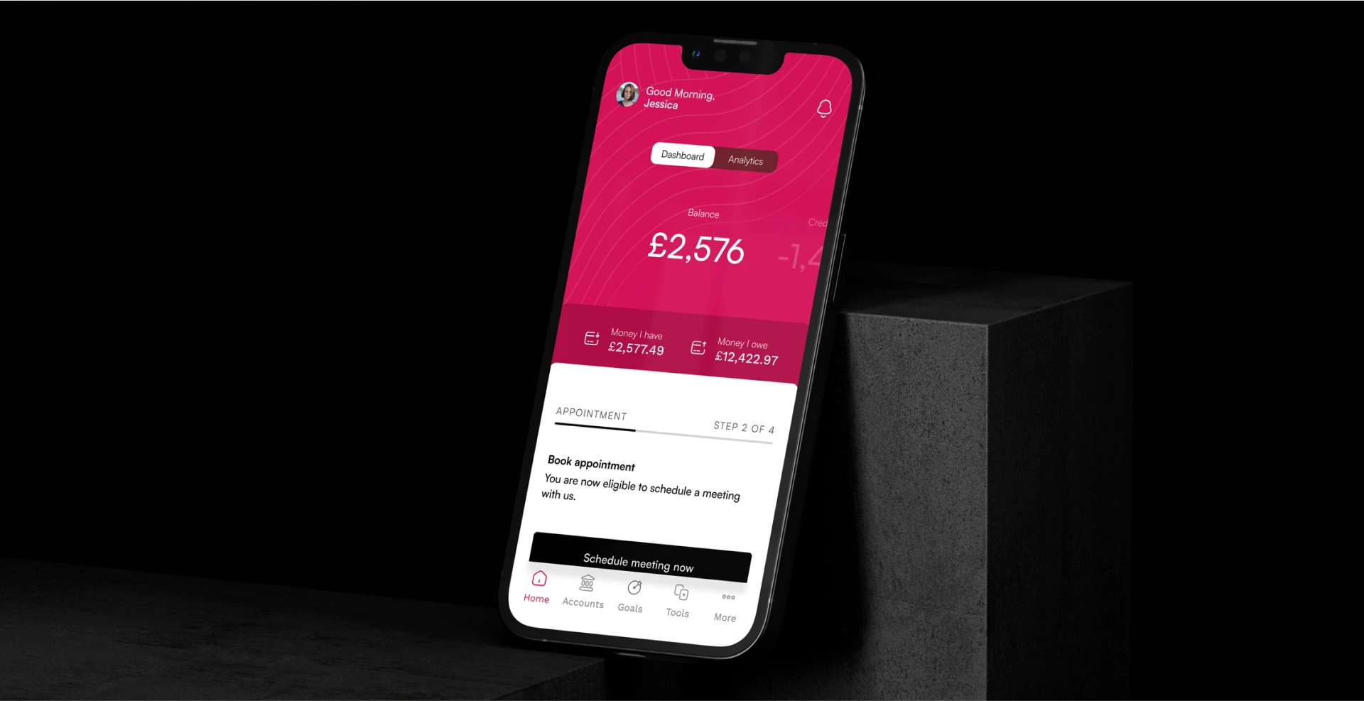
Elifinty is an early-stage startup on a mission to improve financial health for low-income and financially vulnerable households. Their platform connects individuals, creditors, and debt advisors in one shared digital space, where repayment plans, budgeting, and goal-setting work together toward better outcomes for everyone involved.
When Elifinty secured seed funding, they had a working product but no real UX strategy. I was brought in to change that by shaping the product experience.
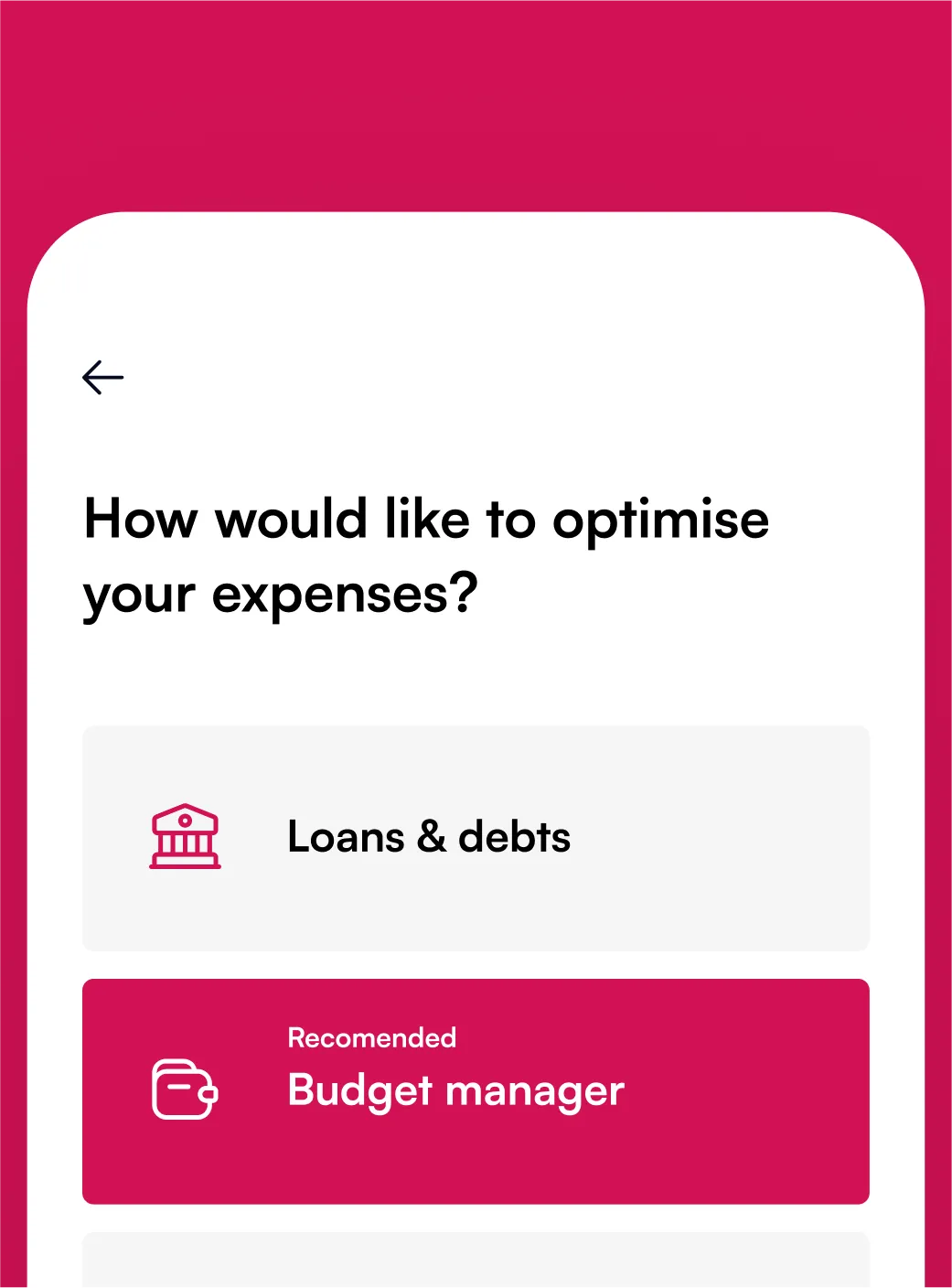
It’s not about lectures or guilt trips. It’s about meeting people where they are and giving them the tools to make smarter financial decisions every day.
Setting goals users can actually reach
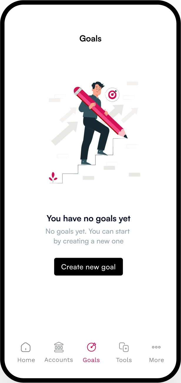
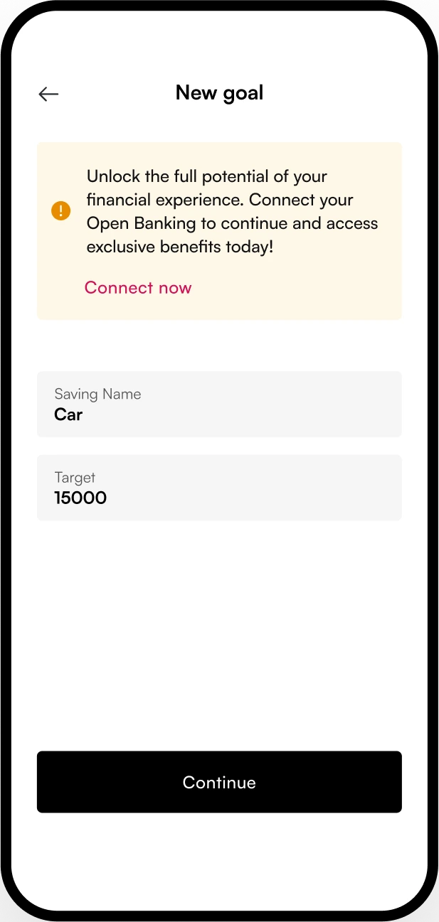
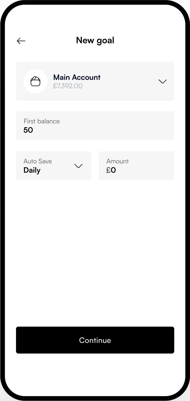
The Goal Manager gives users the ability to plan and save for specific needs—whether that’s groceries for the month or a deposit for a future move. Users set a target amount and timeframe, and the platform intelligently allocates funds, factoring in spending behavior and other obligations..
Drag
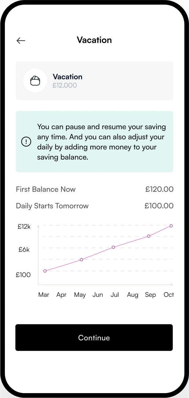
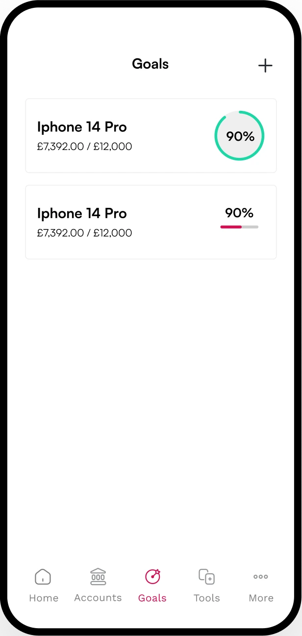
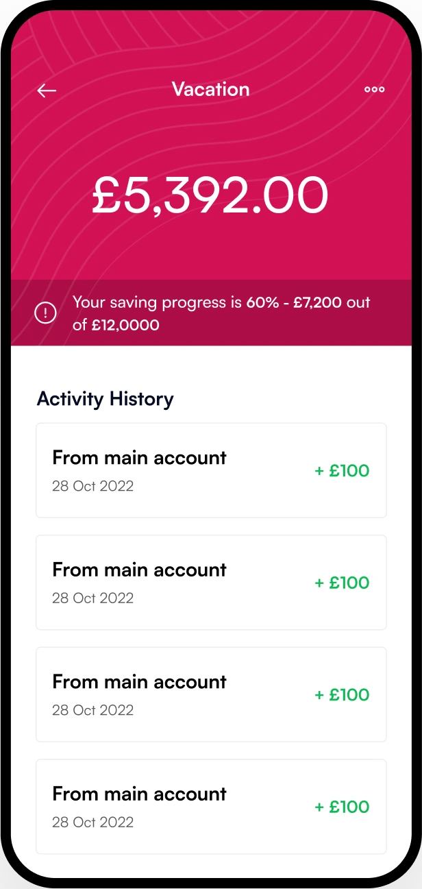
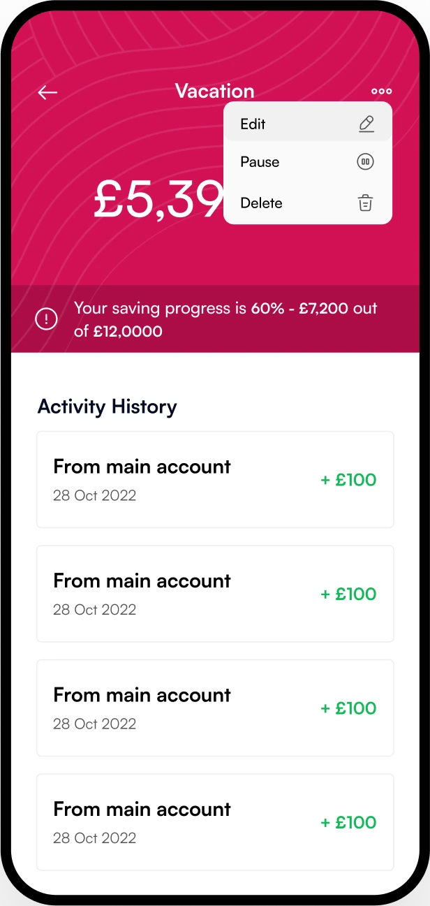
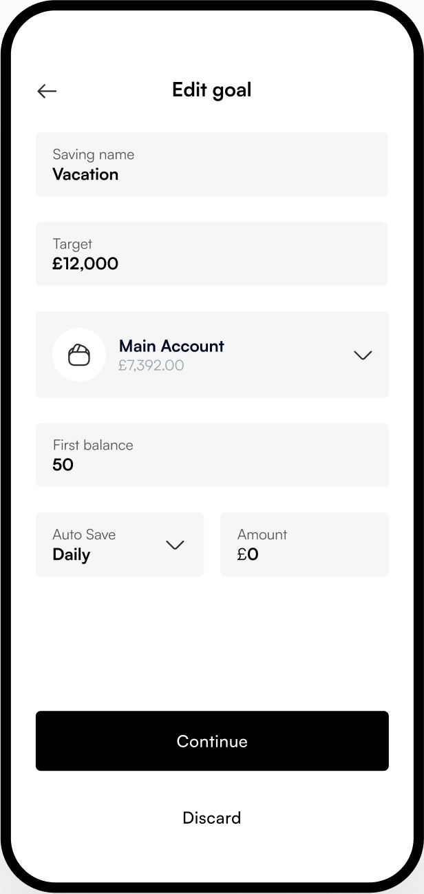

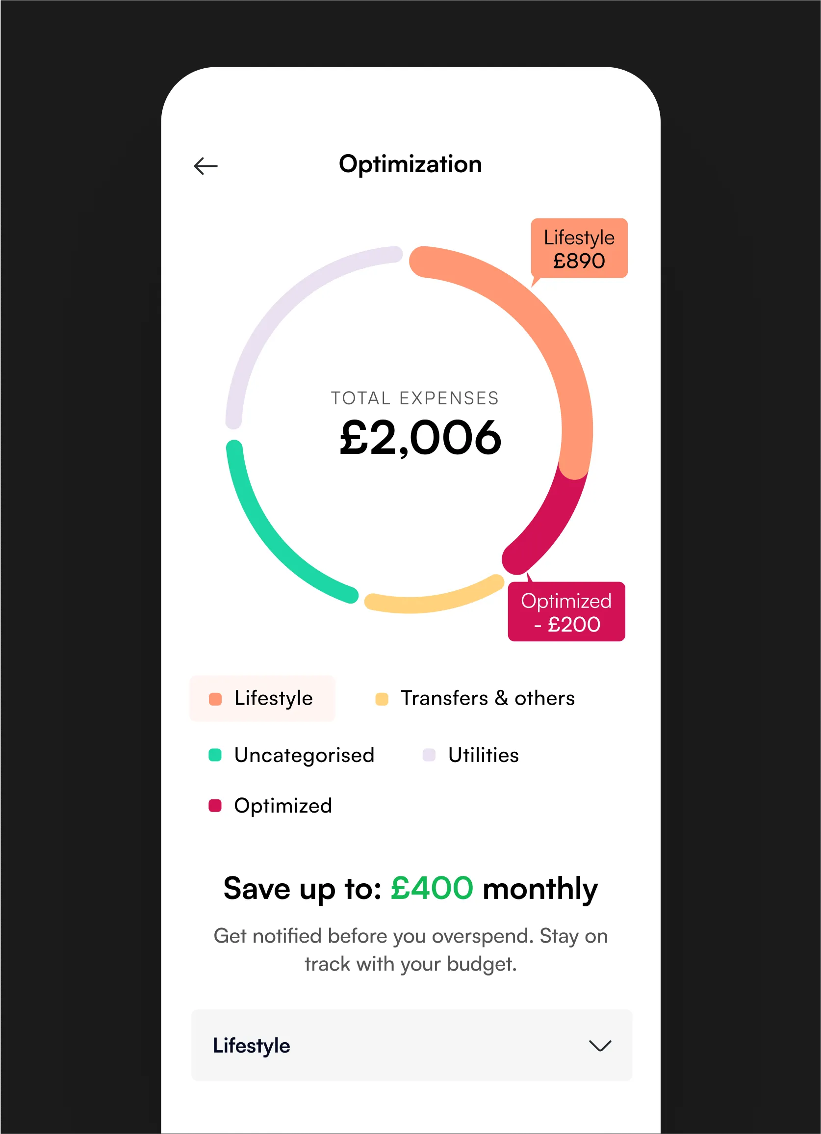
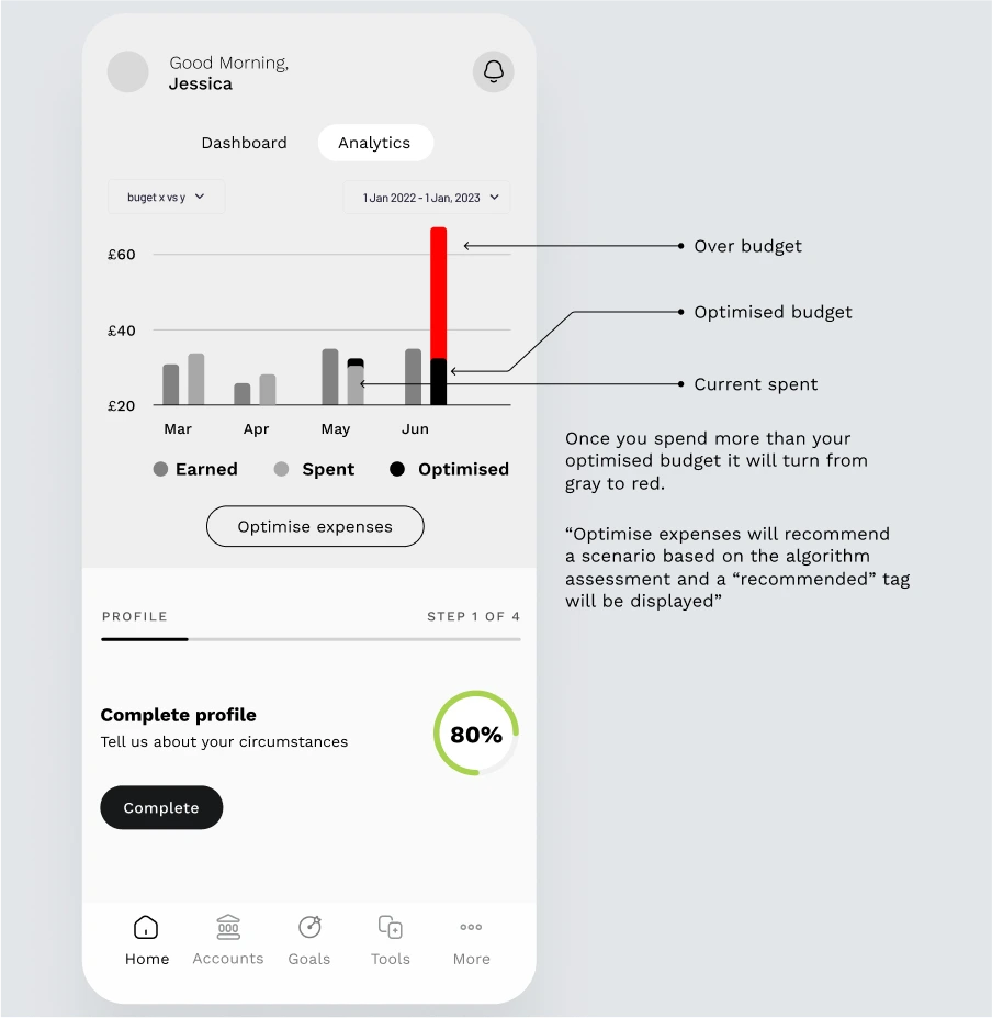
When overspending occurs, the AI recalibrates the user’s budget automatically, helping them stay on track. This adaptive model was key for a user base with inconsistent income and urgent needs.
Turning data into clarity
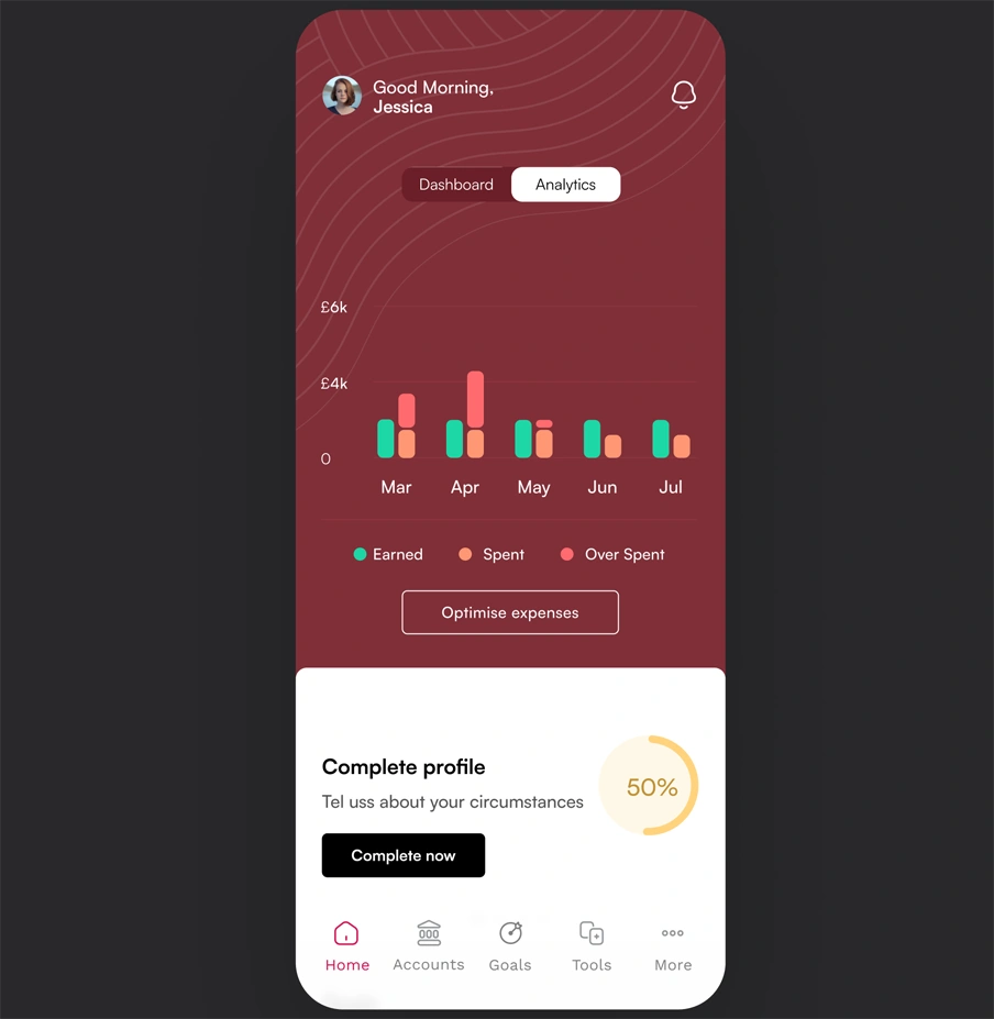
To avoid information overload, I designed a simple dashboard with analytics that actually help. Users can see how much they’ve earned, spent, or overspent across any given month—visualized in a clean, easy-to-scan chart.
Built to scale from day one
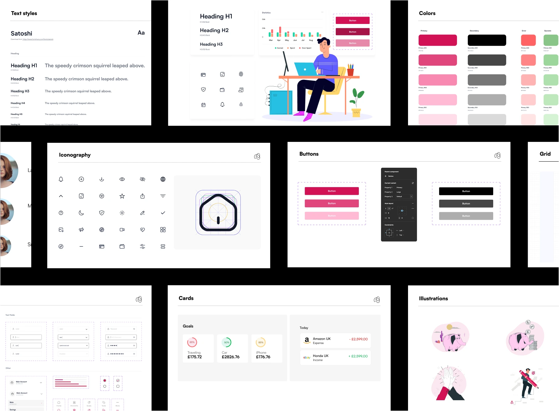
I didn’t just deliver screens, I delivered structure. Alongside the core product design, I created a flexible UI kit to help Elifinty grow with consistency and speed.
The product’s visual language was designed to instill trust, calm, and clarity—three essentials when you’re designing for people facing financial pressure.